
Importance of Contrast in Indian Paintings
The importance of contrast in Indian paintings becomes obvious the moment you stand in front of a work that seems to breathe. Some paintings catch your attention instantly, while others feel flat, quiet, or difficult to read. In many cases, the difference comes down to contrast. It is one of the most powerful tools an artist can use, not only to make a painting visually striking, but also to guide the eye, shape emotion, and give a work its sense of life.
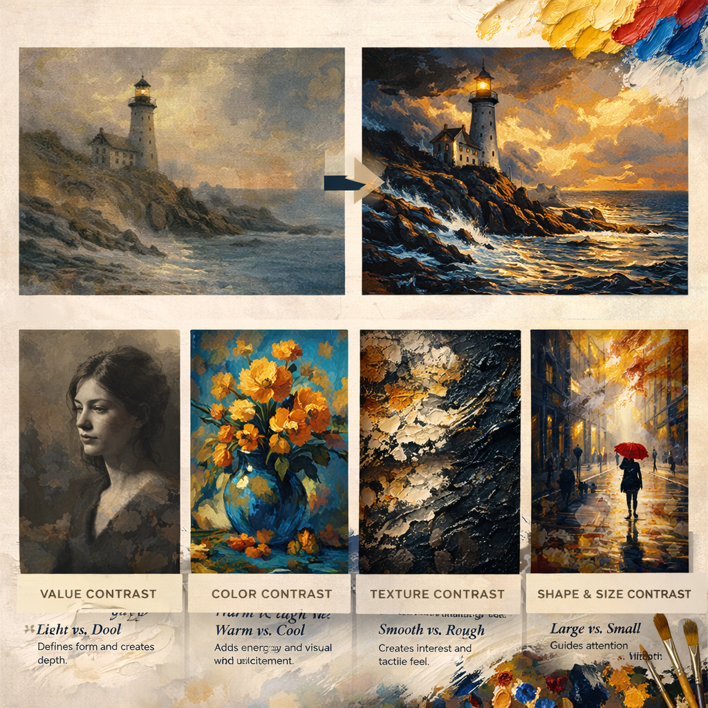
Many people first think of contrast as a simple difference between light and dark. That is part of it, but contrast in Indian painting traditions is much richer than that. It can appear in color, texture, size, shape, detail, and even emotional tone. When used well, contrast helps a painting feel clear and intentional. When ignored, even a technically strong piece can lose impact.
What Contrast Means in Painting
contrast refers to the difference between visual elements. These differences create tension, interest, clarity, and emphasis. A bright highlight against a dark background is contrast. A rough brushstroke beside a smooth passage is also contrast. So is a warm orange placed next to a cool blue, or a large simplified shape set against a field of intricate detail.
What makes contrast so valuable is that it helps the viewer notice relationships. It allows the eye to separate one form from another, understand what matters most, and feel the emotional rhythm of the piece. Without enough contrast, everything can merge together. With thoughtful contrast, a painting gains structure and presence.
This is why contrast in art is not just decorative. It is a core part of how visual language works. Just as a writer uses pacing and emphasis to hold attention, a painter uses contrast to create visual meaning.
The Importance of Contrast in Paintings Goes Beyond Style
The importance of contrast in paintings is often discussed as a matter of style or drama, but it goes much deeper than appearance. Contrast helps a painting communicate. It tells the viewer where to look first, what to feel, and how to move through the image.
Imagine a portrait where the face and background are painted with nearly the same value and intensity. Even if the drawing is accurate, the subject may not stand out. Now imagine the same portrait with a subtle dark background and light falling across the cheek and forehead. Suddenly, the face becomes present. It has shape, priority, and emotional force.
That is what contrast does. It creates separation, but it also creates meaning. Artists rely on it to build focal points, suggest atmosphere, define form, and control visual balance. In landscape painting, contrast can pull a tree forward and push the hills back into the distance. In still life, it can make a reflective glass surface feel crisp against a soft cloth. In abstract work, it can create rhythm and tension without representing anything literal.
How Contrast Directs the Viewer’s Eye
One of the most practical reasons why contrast is important in art is that it controls attention. The human eye is naturally drawn to areas of difference. We notice bright against dark, sharp against soft, saturated against muted, and detailed against simple.
This means contrast acts almost like a visual guide. It helps the painter lead the viewer through the work without using words. A strong contrast near the center of the composition can establish a focal point. Softer contrast in surrounding areas can keep the eye moving without distraction. If every part of the painting shouts with the same intensity, the result often feels chaotic. If every part whispers, the image may feel lifeless.
Good painters understand this balance instinctively or through practice. They know that contrast is not something to spread evenly across the whole canvas. It is something to place deliberately. In many successful paintings, the strongest contrast appears where the artist wants the most attention, and gentler transitions support everything else.
That is why value contrast in painting matters so much. Even when colors change, value often determines readability. A painting can contain beautiful hues, but if the values are too similar, the forms may collapse into one another.
How Great Painters Use Contrast to Create Mood and Depth
The most memorable paintings often succeed because contrast is doing quiet but essential work beneath the surface. It is not always obvious at first glance, but it is almost always there.
In dramatic paintings, strong darks beside sharp highlights can create tension, mystery, or theatrical intensity. In softer atmospheric works, contrast may be reduced in distant areas to suggest haze, space, or calm. A painter does not simply record what things look like. They interpret what deserves emphasis.
This is especially important when creating depth. Objects in the foreground often carry clearer edges, stronger value differences, and richer color contrast than objects farther away. As things recede in space, contrast tends to soften. This mirrors how we naturally see the world. The result is a stronger sense of distance and realism.
Contrast also shapes emotion. A painting with severe light-dark contrast can feel bold, dramatic, even unsettling. A painting with gentle tonal transitions may feel reflective and intimate. Neither is better on its own. What matters is whether the contrast supports the feeling the artist wants to communicate.
Common Mistakes Artists Make with Contrast
Many developing painters understand that contrast matters, but they struggle with how much to use and where to place it. One common mistake is making everything equally important. When every object has the same edge sharpness, color intensity, and value separation, the viewer has no clear place to rest.
Another mistake is relying on color alone while ignoring value. A painter may choose attractive colors, but if those colors share similar value, the painting can still feel flat. This is why checking a painting in grayscale, either mentally or digitally, can be revealing.
Some artists also fear dark values and keep everything in the middle range. This can make a painting feel safe but weak. Others go in the opposite direction and push contrast so hard everywhere that the work becomes exhausting to look at. Contrast is most effective when it is controlled.
There is also the issue of accidental contrast. Sometimes a bright detail or hard edge appears in a background area where it does not support the composition. Even if it is small, it can steal attention from the true focal point. Skilled painters constantly edit these distractions.
How to Improve Contrast in Your Own Paintings
Improving contrast starts with observation, but it grows through decision-making. Before adding more intensity, it helps to ask a simple question: where should the viewer look first? Once that answer is clear, contrast can support it.
A useful habit is to begin with large value relationships rather than details. If the big light and dark patterns work, the painting has a stronger foundation. From there, color and texture can be layered more intentionally. Many artists also benefit from squinting at their subject or reference. Squinting reduces visual noise and makes contrast relationships easier to see.
It also helps to think in terms of contrast variety. Not every area should be handled the same way. Some parts of the painting can hold strong edges and bold differences, while others can remain soft and understated. This creates rhythm and makes the focal area more convincing.