
Watercolor Paintings have a way of capturing moments that feel both gentle and unforgettable. Watch rain fall on a dusty road and something quietly changes. Colours become richer, rough surfaces soften, and an ordinary street suddenly feels full of life. Nothing new has appeared. Water has simply revealed a different side of what was already there. That is what makes watercolor paintings so special. Instead of covering the paper with heavy layers, watercolor allows water and pigment to blend naturally, creating artwork that feels light, luminous, and full of emotion. This unique balance of transparency and spontaneity gives every painting its own character, making no two works exactly alike. Whether you are decorating a new home, refreshing a favourite space, or simply wondering why watercolor paintings continue to captivate art lovers across generations, this guide explores what makes them truly special and how to choose a piece you will enjoy for years to come.
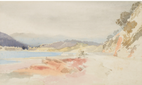 Soft, transparent washes give watercolor landscapes a glow that feels almost lit from within.
Why Watercolor Feels Different From Others
Most painting mediums rely on the artist controlling nearly every detail. Oil and acrylic sit on top of a surface, opaque and obedient, doing largely what the brush tells them to do. Watercolor works differently. The moment pigment meets water, colour spreads on its own terms, edges soften without being asked, and small unplanned patterns appear that no brush could deliberately create. The artist guides the process rather than commanding it, and that difference is exactly what gives watercolor paintings their unmistakable freshness and movement.
Water Becomes An Active Collaborator
Water is not simply a diluting agent in watercolor art. It behaves like a creative partner with its own instincts. A touch more moisture can produce a soft cloud drifting across a landscape. A gentle bloom of pigment can become the highlight on a flower petal. Even the accidents tend to add character rather than ruin the work. Learning watercolor painting has less to do with mastering total control and more to do with knowing when to let the water lead, which is one of the more rewarding creative lessons an artist can learn.
Transparency Gives Every watercolor Paintings Its Glow
Picture sunlight moving through stained glass. The colour does not sit flat on the surface, it seems to glow from within. Watercolor produces a similar illusion. Because the layers are transparent, light bounces off the white paper beneath the pigment before travelling back through it, creating a softness that feels bright and airy rather than heavy. Oil paintings build depth through thick layers and acrylic through opacity, while watercolor paintings create beauty simply by letting light become part of the artwork.
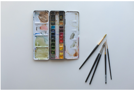 A modest palette, a few brushes, and quality paper are often all a watercolor artist needs to begin.
Why Watercolor paintings Rooms Feel Instantly Calmer
Some paintings make a room feel peaceful before a viewer even registers what the image depicts. Watercolor tends to have that effect. Soft transitions, organic shapes, and gentle colour gradients reduce visual tension in a way sharp, high contrast imagery rarely does. Researchers studying creativity and stress have found that making art measurably calms the body. A widely cited Drexel University study found that 75 percent of participants showed lower cortisol levels after just 45 minutes of art making, regardless of skill level. Watercolor, with its slow blending and forgiving nature, is particularly suited to that calming effect, which explains why it has become a favourite in homes, offices, wellness spaces, and hospitality interiors.
Simple Materials Create Extraordinary Artistic Results
One of watercolor’s quiet strengths is how little it demands to begin. A small paint set, a few good brushes, quality paper, and clean water are genuinely enough to produce remarkable work. What is difficult is not the materials, it is learning to truly see. A leaf is never simply green, it holds yellow highlights, cool blue shadows, and warm reflected light most people walk past without noticing. Watercolor teaches observation before it teaches technique, and once that habit forms, the everyday world tends to look noticeably more colourful.
Why Beginners Struggle Before Loving It
Nearly every new watercolor painter feels frustrated at first. Paint spreads faster than expected, colours dry lighter than intended, and edges refuse to stay where they were placed. These experiences are completely normal and not a sign of a lack of talent. Artists who stick with the medium eventually stop fighting the water and start working alongside it, learning how damp paper changes colour movement and how drying time shapes texture. What feels unpredictable in the first month usually feels intuitive within a year, which is part of why watercolor rewards patience more than raw natural ability.
One Medium That Paints Almost Anything
Ask several watercolor artists about their favourite subject and expect several different answers. Some devote themselves to delicate botanical studies filled with intricate petals. Others chase dramatic landscape paintings where soft washes suggest mist rolling across a valley. Wildlife painters use the same transparent layers to capture birds, tigers, and horses with striking softness, while portrait artists rely on watercolor for skin tones that feel remarkably alive. Even abstract watercolor art has found a strong place in contemporary interiors, where its flowing colour introduces movement without overwhelming a room. Urban sketchers use the same medium to document bustling streets and quiet cafés with loose, energetic brushwork, while food and fashion illustrators rely on its transparency to suggest texture with only a few confident strokes. Few artistic mediums move this comfortably between realism and imagination, which is exactly why watercolor keeps attracting new artists generation after generation.
Paper Matters More Than The Paint
Many beginners spend hours comparing paint brands while overlooking the material with the greatest influence on the final result, the paper. Thin paper wrinkles, absorbs water unevenly, and often leaves colours looking dull rather than vibrant, no matter how good the pigment is. Quality watercolor paper gives pigment room to move naturally while holding enough moisture for smooth blends. Cold pressed paper suits most landscapes, florals, and portraits, hot pressed paper works well for fine detail, and rough paper adds dramatic texture to expressive scenes. The same brush, the same colours, and the same artist can produce a noticeably more confident painting simply because the foundation underneath it changed.
Realistic Detail Versus Loose Expressive Style
Watercolor comfortably holds both photographic precision and pure imagination. Some artists spend weeks building transparent layer over transparent layer until a painting looks nearly identical to a photograph. Others work with a handful of confident brushstrokes that suggest a scene rather than describe it in full. Neither approach is superior, they simply speak different visual languages. Loose watercolor celebrates movement and feeling, while realistic watercolor rewards patience and close observation. Between those two poles sit botanical illustration, urban sketching, and abstract watercolor art, proof that the medium never insists on becoming just one thing. A single artist may even move between styles depending on mood or subject, painting a tightly rendered floral study one week and a loose, gestural seascape the next, without either feeling like a departure from their identity as a painter.
Every Watercolor Painting Is Unique
No two watercolor paintings are ever truly identical, even when an artist paints the same subject twice. The movement of water across the sheet, the absorbency of that particular paper, and the way pigments settle and blend all shift slightly with every attempt. Even a practiced hand working from the same reference photo will produce two paintings with different textures, different bloom patterns, and a slightly different mood. This is not a limitation of the medium, it is one of its greatest strengths. Collectors and homeowners are drawn to that individuality because a watercolor painting cannot be mass produced in any meaningful sense. Every piece carries its own small story, shaped by the exact conditions in the room where it was painted, which is part of why original watercolor art tends to feel more personal than most other decorative choices.
Small Daily Habits Build Real Confidence
Talented watercolor artists are usually not more gifted than everyone else, they simply practice differently. Instead of chasing one perfect painting every weekend, experienced painters fill sketchbooks with small, low pressure studies, one page of clouds, another of leaves, another of nothing but shades of blue. Each small exercise builds muscle memory for how much water a brush should carry and how long paper stays workable. Confidence in watercolor rarely arrives overnight. It grows gradually, through hundreds of small, unglamorous repetitions that eventually add up to real skill.
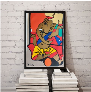 Original, hand painted pieces bring the same softness and individuality prized in fine watercolor art. View this piece.
Bringing Watercolor Art Into Your Home
Interior designers often describe watercolor as one of the most adaptable art styles for modern homes, and colour is only part of the reason. Unlike bold acrylic work or heavily textured oils, watercolor introduces elegance without dominating a room. A floral watercolor can soften a bedroom and make it feel restful rather than stark. A misty landscape can bring a sense of calm to a living room without competing with furniture or lighting. A minimalist botanical study can freshen a kitchen or dining space, and a loose, expressive abstract piece can add quiet energy to a home office or creative studio without becoming a distraction during focused work. Because watercolor rarely feels visually heavy, it blends easily with Scandinavian interiors, minimalist apartments, traditional homes, and modern offices alike, letting a room feel curated rather than simply decorated.
Why Original Paintings Hold Different Value
There is nothing wrong with a beautiful print, and prints make art accessible to far more people. Original watercolor paintings, though, offer something no reproduction can fully copy. Each bloom of colour created by flowing water happened exactly once, and every transparent layer reflects a decision the artist made in that specific moment. Small imperfections become evidence of a human hand rather than flaws to correct. Collectors often describe owning original art as owning an experience rather than an image, which is part of why platforms such as The Brushstrokes Company focus on curating handcrafted, one of a kind pieces rather than mass produced décor. Provenance also plays a role in that value. Knowing who painted a piece, when it was created, and how it has been cared for adds a layer of confidence for buyers who plan to hold onto a painting for years or eventually pass it down. A clear record of origin, honest condition notes, and close up photographs of texture matter just as much as the image itself when buying original watercolor art online rather than seeing it in person first.
Mistakes Nearly Every Beginner Makes Once
Every experienced watercolor artist remembers the first time too much water flooded the paper, or when a mixed colour turned into something unrecognisable, or when one area was repainted so many times the paper began to weaken. These moments feel discouraging in the moment but teach lessons no tutorial can replace. A common early mistake is correcting every brushstroke immediately rather than letting a layer dry first, which usually produces cleaner, more vibrant results. Using too many colours in a single painting is another frequent misstep, since simplicity tends to create stronger harmony than complexity. Perhaps the most common mistake of all is comparing a first attempt with someone else’s thousandth painting, forgetting that every skilled artist once started with nothing but curiosity and a blank sheet of paper. Many beginners also focus entirely on colour while overlooking value, the relative lightness or darkness of each area. A painting built from accurate light and shadow will usually read as confident and dimensional even with a fairly limited palette, while one built from many colours but flat value tends to feel muddy no matter how carefully it was mixed.
Choosing Colors That Match Your Space
Colour shapes the atmosphere of a room more than most people expect. Soft blues and greens introduce calm, warm earth tones create comfort, and vibrant florals add energy and freshness. Neutral watercolor palettes tend to suit minimalist interiors, while more colourful compositions become natural focal points in contemporary spaces. Rather than choosing a painting purely because you like it in isolation, it helps to consider how its palette will sit alongside your existing furniture, walls, and lighting. A room with warm wood tones and neutral upholstery tends to welcome earthy greens, ochres, and soft terracotta washes, while a cooler, monochrome interior often benefits from a painting that introduces a single confident accent colour rather than several competing ones. Natural light also changes how watercolor reads on a wall. A north facing room with cooler light can make blues and greys feel a little flat, so warmer palettes often read better there, while south facing rooms flooded with sunlight can carry cooler, more muted tones beautifully.
Finding The Right Size And Placement
The size of a watercolor painting should complement both the wall and the room around it. Large statement pieces create elegant focal points in living rooms and dining areas, while medium sized artworks tend to suit bedrooms, offices, and hallways more comfortably. Smaller framed watercolors can also be grouped together into a gallery wall, which works particularly well for collectors who enjoy mixing landscapes, florals, and abstract pieces in one arrangement. Getting the proportions right helps a painting feel like part of the room rather than an afterthought hung on an empty wall. As a rough guide, a piece hung above furniture such as a sofa or console table should span roughly two thirds of that furniture’s width, so it reads as a considered pairing rather than a small accent lost above a large piece. When hanging at eye level in a hallway or stairwell, the centre of the artwork should typically sit around fifty seven inches from the floor, which keeps the composition comfortable to view whether someone is standing close or passing by.
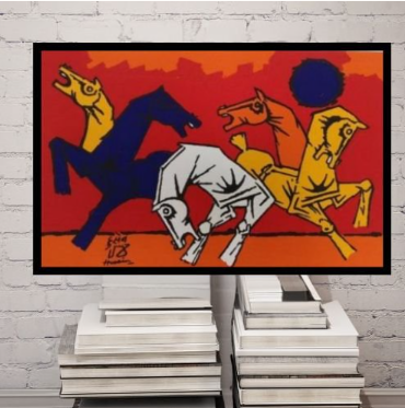 Medium and large format pieces make natural focal points above a sofa or console table. View this piece.
Frames That Complete The Artwork
The right frame enhances a watercolor painting without pulling attention away from it. Simple wooden frames tend to create a warm, natural appearance, while sleek black or white frames suit more contemporary interiors. High quality matting and UV protective glass help preserve delicate paper and pigment while keeping the fine detail visible rather than obscured by glare. A thoughtfully chosen frame quietly finishes the presentation and allows the painting itself to remain the centre of attention.
Caring For Watercolor Paintings Properly
Watercolor paintings reward a small amount of ongoing care. Keeping them away from prolonged direct sunlight helps prevent fading, while a dry environment protects the paper from moisture damage and warping. Acid free matting and UV protective glass add further protection without altering how the artwork looks. Occasional dusting of the frame and careful handling during moves or renovations go a long way toward keeping a painting in the same condition for decades, allowing it to be enjoyed well beyond the person who first chose it. Humidity deserves particular attention, since watercolor paper can absorb moisture from a damp bathroom or an uninsulated exterior wall over time, gradually causing rippling or discolouration. Choosing a dry, temperature stable spot for display, checking the back of the frame occasionally for signs of moisture, and avoiding kitchens or steamy bathrooms altogether will keep a watercolor painting looking as fresh as the day it was framed.
Where Thoughtful Art Collections Begin
Every collection starts with a single painting that created a genuine emotional connection, not the largest or most expensive piece available. Today’s watercolor artists work across an enormous range of styles, from peaceful landscapes and botanical illustration to expressive abstracts and contemporary mixed media, which means almost any home can find a piece that fits both its interior and its personality. Some collectors begin with a single calming landscape for a bedroom, others start with a bold floral piece for an entryway, and many simply wait until a painting stops them mid step and refuse to let logic talk them out of it. Explore the full art collections online or browse the dedicated watercolor paintings collection to see how varied the medium can be, from quiet botanical studies to expressive, colour forward abstracts. A carefully chosen watercolor painting does more than fill a wall, it adds warmth, light, and a bit of quiet character to a room every single day.
Browse the full watercolor paintings collection from The Brushstrokes Company, explore original works on the original paintings page, or get in touch to discuss a custom commission for your home. For a broader look at painting styles and techniques, read our guide on what painting means and how each medium compares.
Common Questions About Watercolor Paintings
Can watercolor paintings last for decades?
Yes. When created with professional grade pigments and acid free paper, then framed behind UV protective glass, watercolor paintings can retain their beauty for generations.
Are watercolor paintings suitable for modern homes?
Absolutely. Their soft colours and transparent washes complement minimalist, Scandinavian, traditional, and contemporary interiors without overwhelming a room.
Which watercolor subjects work best for beginners?
Simple flowers, leaves, sunsets, clouds, and minimal landscapes are excellent starting points because they build blending and brush control without feeling overwhelming.
How many colours do I need to start painting?
A basic palette of eight to twelve high quality colours is usually enough. Learning to mix colours well matters more than owning a large collection of paints.
Why do watercolor paintings look lighter once dry?
Water evaporates as the painting dries, so pigment appears softer than it did when first applied. Most artists build colour gradually in layers to account for this.
Should I buy an original water painting or a print?
It depends on budget and purpose. Original paintings offer uniqueness, texture, and craftsmanship, while quality prints offer flexibility and a lower price point for larger decorating plans.
Are watercolor paintings expensive to collect?
Prices vary widely based on the artist, size, and level of detail. Small original works can be affordable, while museum quality pieces by established artists command premium prices.
Is watercolor only suitable for landscapes and flowers?
Not at all. Watercolor is widely used for portraits, wildlife, architecture, food illustration, abstract art, fashion illustration, and travel journaling, making it one of the most flexible mediums available to artists today.