
Stand in front of two paintings and you’ll often feel drawn to one before you know why. They may feature similar subjects, yet one feels calm while the other feels vibrant or dramatic. More often than not, the difference lies in color. That is where color theory begins. It explains how colors work together, how they influence emotions, and why certain combinations naturally feel balanced while others create energy or contrast.
Color theory is more than a set of rules for artists. It is a practical guide that has shaped paintings, interiors, fashion, and design for centuries. By understanding how colors interact, artists create depth and harmony, while homeowners and decorators use the same principles to build spaces that feel inviting, elegant, or full of life.
In this guide, you’ll discover what color theory is really about, why it matters in art and interior design, and how you can use it to choose artwork with confidence. Whether you’re selecting your first painting or looking for a statement piece that transforms your home, these principles will help you see art in an entirely new way and make better choices when exploring the collection at The Brush Strokes and Co.
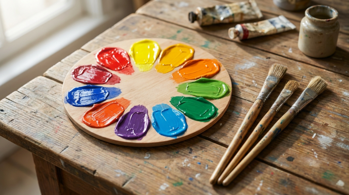
Understanding Color Theory Basics
Color theory is simply the study of how colors relate to each other and how those relationships affect the way we see a space or a piece of art. It’s the reasoning behind why some combinations feel effortless while others feel off, even to someone with no formal design background.
Once you understand the basics, choosing paintings or decorating a room stops being guesswork. You start noticing why a certain palette makes a room feel calm, energetic, or sophisticated, and you can use that knowledge on purpose instead of by accident.
You don’t need to be a working artist to get value from this either. Learning how color theory works simply makes you a sharper judge of the artwork you’re drawn to, and it helps you pick pieces that actually fit your space rather than fighting it. According to the Interaction Design Foundation, color theory forms the foundation of nearly all visual design, from fine art to interfaces.
Exploring the Color Wheel
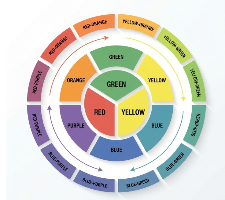
The color wheel is the single most useful tool for understanding how colors relate to one another. It arranges hues in a circle, which makes it easy to see at a glance which combinations will feel balanced and which will create bold contrast.
Studying the wheel explains a lot that used to feel like pure intuition. It shows you why certain pairings feel calm and others feel charged, and it works as a practical reference when you’re matching a painting to a room’s existing furniture, walls, and trim.
The color wheel isn’t just an art school concept either. The same logic shows up in fashion, branding, photography, and architecture, which is part of why it’s worth understanding even if you never pick up a paintbrush yourself.
Primary Colors
Red, blue, and yellow sit at the core of the color wheel. They can’t be mixed from any other colors, which is exactly why every other shade on the wheel eventually traces back to one of these three.
Artists treat primary colors as a starting point rather than a finished palette. From these three, an almost endless range of shades and combinations becomes possible.
Secondary Colors
Mix two primary colors together and you get a secondary color. Green, orange, and purple each bring their own character to a composition, and they’re a common way to add variety without straying too far from a balanced palette.
You’ll find secondary colors doing a lot of quiet work in both traditional paintings and contemporary pieces, often bridging the gap between bold primaries and more muted tones.
Tertiary Colors
Tertiary colors come from blending a primary color with a secondary color sitting next to it on the wheel. The result is a subtler, more nuanced shade that adds depth without overwhelming a piece.
These in between tones are often what give a painting its sense of realism or richness. They’re rarely the star of a composition, but they’re usually what makes the whole thing feel cohesive.
Understanding Color Harmony Principles
Color harmony describes how different colors work together to create a pleasing result rather than a chaotic one. When a palette is harmonious, each color supports the others instead of competing for attention.
Artists lean on color harmony to guide where your eye lands first and to build a specific emotional tone into a piece, whether that’s a peaceful landscape or a bold, energetic abstract. This same logic applies directly to decorating.
Picking wall art with colors that echo your existing decor is one of the fastest ways to make a room feel intentional. It’s the difference between a space that feels curated and one that just feels randomly assembled.
Complementary Color Schemes
Complementary colors sit directly across from each other on the wheel, like blue and orange or red and green. That opposition is exactly what creates such strong visual contrast when the two are placed side by side. Used well, complementary pairings make a piece feel confident rather than chaotic, and they’re a favorite trick for making a single element in a painting really stand out. Learn more about the mechanics behind this in this complementary colors guide.
Analogous Color Schemes
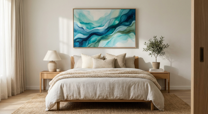
Analogous colors sit next to each other on the wheel, think blue, teal, and green. Because they’re so closely related, they blend naturally and rarely clash. This is usually the easiest scheme for anyone new to color theory to work with, since it tends to produce calm, cohesive results almost automatically, in both artwork and interiors.
Triadic Color Schemes
A triadic scheme pulls three colors that sit at even intervals around the wheel. It’s a bit more adventurous than analogous pairings, but when it’s balanced correctly, it creates real energy without tipping into visual chaos. This is a common choice among artists who want a piece to feel lively and dynamic on the wall.
Monochromatic Color Schemes
Monochromatic simply means working within shades, tints, and tones of a single color. It sounds limiting, but the result usually reads as refined and quietly sophisticated. With only one hue to work with, texture and subtle value shifts end up doing most of the heavy lifting, which is part of why monochromatic pieces often feel so polished.
Warm Colors and Cool Colors
Every color on the wheel falls broadly into one of two camps, warm or cool, and that split has a real effect on how a room feels. Warm colors, think red, orange, and yellow, tend to bring energy and grab attention. Cool colors, like blue, green, and purple, lean toward calm and restraint.
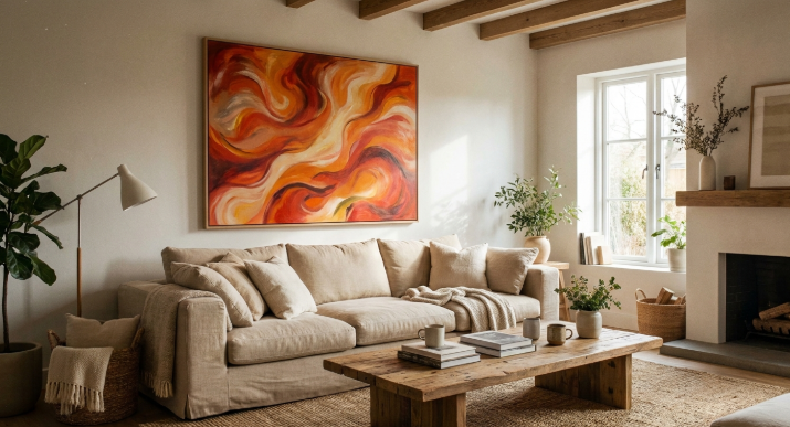
Warm toned paintings naturally become focal points, which makes them a strong choice for living rooms, dining spaces, or any area meant for conversation and activity. There’s a reason so many statement pieces lean into reds and oranges.
Cool toned artwork does the opposite job well. It suits bedrooms, reading nooks, and home offices, anywhere you actually want the room to slow down a little rather than energize the people in it.
Color Psychology in Art
Color psychology looks at how specific colors influence emotion and behavior, and artists have leaned on this instinctively for centuries. A single painting can quietly nudge someone toward happiness, calm, excitement, or reflection, all without a single word on the canvas.
Bright, saturated colors tend to read as energetic and optimistic, while softer, muted tones lean toward comfort and relaxation. Darker shades often bring in a sense of mystery or elegance, depending on how they’re used. Research from Sherwin Williams on color psychology backs this up, showing measurable links between specific hues and mood.
Keeping this in mind when you shop for art isn’t overthinking it. The right painting does more than fill wall space. It sets a tone for the room and shapes how people feel the moment they walk in.
Color Theory in Interiors
In interior design, color theory is what ties a room together instead of leaving it feeling like a collection of unrelated pieces. Walls, furniture, lighting, and artwork all need to speak the same visual language, and a single well chosen painting can pull that off on its own.
Different rooms call for different palettes depending on their purpose. Soft, neutral tones tend to suit relaxing spaces, while brighter combinations bring energy and personality to more social areas of the home.
Art is frequently the finishing touch in a room, not an afterthought. The right piece can reinforce a palette that’s already working, or introduce just enough contrast to give the whole space a focal point.
Choosing Better Wall Art
Picking wall art well means looking past personal taste alone and considering how a piece fits the room’s colors, scale, and overall style. Color theory makes this a lot less like guesswork.
Start by noticing which colors already dominate the space. From there, you can either choose a painting that reinforces that palette for a cohesive look, or pick something that contrasts deliberately to create a focal point. Both routes work when they’re done with intention.
Size and placement matter just as much as color. Browsing a curated selection, like the original paintings available through The Brush Strokes and Co, makes it easier to compare pieces side by side and see what actually fits before committing.
Building Balanced Color Palettes
A balanced palette brings order to both a painting and a room. It leans on colors that complement each other while still holding enough contrast to stay visually interesting rather than flat.
Many artists start with one dominant color and build outward from there, layering in supporting shades and small accent colors. The same approach translates directly to decorating, where a room’s palette often benefits from that same one dominant, several supporting structure.
Taking the time to plan a palette properly tends to produce spaces that feel timeless rather than trendy. Artwork does its best work when it’s part of that plan from the start, not squeezed in as an afterthought.
Common Color Mistakes
Packing too many bold colors into one space is probably the most common misstep. Vibrant colors are exciting in small doses, but stacked together they tend to make a room feel cluttered rather than lively.
Lighting gets overlooked constantly too. Natural light, warm bulbs, and cool bulbs all shift how a color reads throughout the day, so it’s worth viewing a painting under the room’s actual lighting before deciding it’s the right fit.
The last common mistake is treating artwork as separate from the rest of the room. Paintings work best when they cooperate with the existing palette rather than fight it, which is really the whole point of thinking about color theory in the first place.
Artists and Color Theory
Artists use color with intention, not by accident. Every choice helps establish balance, direct attention, and set the emotional tone of a piece, and even small shifts in hue can change how a painting is read entirely.
Plenty of well known artists built their reputations around a signature relationship with color, some through bold contrast, others through soft, deliberate transitions. Their grasp of color theory let them communicate feeling well beyond whatever the literal subject of the painting happened to be. You can see this instinct clearly in the work of artists like S H Raza, whose compositions lean almost entirely on color and form to carry meaning.
Contemporary artists carry that same tradition forward across paintings, prints, and digital work today. Color theory hasn’t gone out of style, it’s still one of the most reliable tools for turning an idea into something people actually feel.
Applying Colors at Home
Putting color theory to work at home starts with deciding what mood you want each room to have. Warm tones tend to suit social spaces, while cool tones work better where the goal is rest or focus.
When you’re shopping for paintings, think about how their colors will sit against your existing walls, furniture, and accents. A piece that echoes the current palette will blend in smoothly, while one that contrasts deliberately can become the room’s focal point. Exploring a broader art collection is a practical way to compare both approaches before you settle on a piece.
Understanding color theory also just makes shopping for art less stressful. Instead of guessing, you’re choosing pieces that reinforce the mood you’re after and that are likely to still feel right years from now.
Frequently Asked Questions
What is color theory?
Color theory is the study of how colors interact with each other and how they influence visual balance, emotion, and design. It provides the foundation for creating effective artwork and harmonious interiors.
Why is the color wheel important?
The color wheel explains the relationships between different colors in a simple visual format. It helps artists and homeowners build balanced combinations and understand which colors naturally work well together.
How does color psychology affect art?
Color psychology shapes the emotions a viewer experiences when looking at a painting. Different colors can create feelings of calm, excitement, warmth, or sophistication depending on how they’re used within a composition.
What are complementary colors?
Complementary colors sit directly opposite each other on the color wheel. They create strong visual contrast and help specific elements stand out while the overall composition stays balanced.
How do I choose wall art?
Choose wall art that complements your room’s existing color palette, scale, and overall style. Applying basic color theory makes it much easier to find pieces that feel balanced and enhance the space rather than compete with it.
How do warm and cool colors affect a room?
Warm colors add energy and make a space feel more inviting, while cool colors encourage relaxation and calm. Combining both thoughtfully tends to produce rooms that feel balanced rather than one note.
Color theory isn’t really about memorizing rules. It’s a way of noticing why some rooms and some paintings just work, and using that awareness to make better choices going forward. Once you start seeing color relationships instead of just colors, choosing art for your home gets a lot easier.
Ready to put it into practice? Browse the current collection at The Brush Strokes and Co and find a piece whose palette was made for your space.