
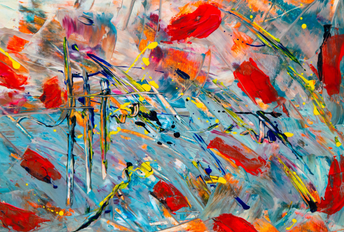
A warm-toned painting brings instant richness to a neutral living room wall. (Photo: Pexels)
The right piece of art can change how a room feels the moment you walk into it, and oil pastel art has a particular gift for doing this. A living room that feels flat under white walls and grey upholstery suddenly feels inviting once a single oil pastel painting, thick with colour and texture, takes its place above the console. This is not decoration for the sake of decoration. It is a deliberate use of colour, texture, and craftsmanship to make a house feel like a home.
Oil pastel art works because of how the medium itself behaves.It is a soft, wax and pigment based drawing material that sits directly on paper or board in thick, buttery layers, unlike watercolour or ink which soak in and flatten. That thick application catches light differently across a room, and it holds saturated colour in a way few other mediums can match. A well-placed drawing does more than fill a blank wall. It gives a room depth, warmth, and a sense that someone has thought carefully about how the space should feel.
This piece looks at why this art works so well for warming up interiors, how to read an oil pastel sketch for the right room, which colours suit different spaces, and how to style, place, and care for these pieces so they stay beautiful for years.
What Makes Oil Pastel Feel So Warm
Oil pastel earns its reputation for warmth through pigment density. Because it sticks are made from pigment bound in wax and oil rather than diluted in water, the colour sits on the surface in a solid, almost sculptural layer. Light bounces off this thick pigment differently than it does off a flat print or a thin watercolour wash, which is why an oil pastel drawing often looks richer in person than in a photograph.
This density means an oil pastel drawing can hold deep ochres, burnt siennas, and warm reds without looking chalky or washed out. Even a predominantly cool-toned sketch, done in blues or greens, tends to carry a certain softness because the wax base gives every stroke a slightly diffused, glowing edge rather than a hard, printed line.
There is also a tactile honesty to oil pastel work that digital prints cannot replicate. You can often see the direction of each stroke, the pressure of the artist’s hand, and small variations in texture across the piece. According to the Smithsonian’s American Art Museum, works that retain visible traces of an artist’s process tend to create a stronger emotional connection for viewers than those that appear mechanically smooth, which is part of why handmade pieces so often feel warmer than their printed equivalents.
Reading An Oil Pastel Sketch For Your Room

Blended, layered strokes are what gives fsketch its glow and depth. (Photo: Pexels)
Not every oil pastel sketch will suit every room, so it helps to know what to look for before buying one. A good oil pastel sketch usually shows layering, meaning the artist has built up two or three colours on top of each other rather than relying on a single flat tone. This layering is what creates the sense of glow that makes oil pastel art so effective at warming a space.
Look closely at the blending in the piece. Smooth transitions between colours, especially where warm and cool tones meet, suggest a more skilled hand and usually translate into a piece that reads well from across a room. Rougher, more textured strokes are not a flaw. In fact, visible texture often photographs and displays beautifully under warm interior lighting, since the raised pigment catches shadow and highlight in a way flat prints cannot.
Subject matter also matters when reading an oil pastel sketch for your home. A landscape with a setting sun, a close study of flowers, or a portrait rendered in warm skin tones will naturally lean into the cosy, inviting quality most people want from their living spaces. A more abstract or geometric oil pastel sketch can still feel warm, but the effect comes more from the colour palette than the subject itself.
Choosing Oil Pastel Colours For Each Room
Colour choice is where an oil pastel painting either enhances a room or fights against it. Since oil pastel colours can range from soft pastels to deeply saturated pigments, matching the palette to the room’s existing tones makes a real difference.
- Living rooms generally suit oil pastel colours in the amber, terracotta, and deep gold family, a palette colour theory experts describe as advancing and energising a space, especially in homes with neutral or grey furnishings that need a focal point of warmth. A single large oil pastel painting in these tones above a sofa or console table often does more to warm up a room than several smaller accessories combined.
- Bedrooms call for softer oil pastel colours, since this is a space meant for rest rather than stimulation. Muted rose, dusty peach, and soft browns work well here, offering warmth without the visual intensity of a bolder palette.
- Dining areas can handle richer, more saturated oil pastel colours, since these spaces are often used in the evening under warm artificial light, which naturally intensifies deep reds, oranges, and browns in the artwork.
- Home offices and study corners benefit from oil pastel colours that lean slightly cooler, such as warm greens or muted blues layered with small touches of ochre, giving the space enough calm for focus while still avoiding a cold, clinical feel.
| Room | Suggested Oil Pastel Colours | Why It Works |
| Living Room | Amber, terracotta, deep gold | Creates an inviting focal point against neutral furnishings |
| Bedroom | Dusty rose, soft peach, warm brown | Adds warmth without overstimulating a rest space |
| Dining Area | Deep red, burnt orange, chocolate brown | Intensifies beautifully under evening lighting |
| Home Office | Warm green, muted blue with ochre accents | Balances calm focus with a touch of warmth |
| Entryway | Golden yellow, rust, warm ivory | Gives visitors an immediate sense of welcome |
Where To Place Oil Pastel Drawing Pieces
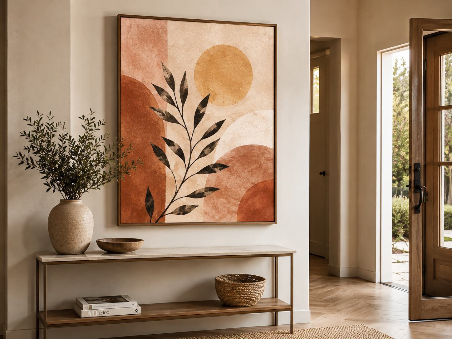
A warm-toned piece near the entryway gives visitors an immediate sense of welcome.
Placement decides whether an oil pastel drawing actually delivers the warmth it promises. A stunning piece hung in the wrong spot, at the wrong height, or under harsh lighting can lose most of its impact.
Hang oil pastel art at eye level, roughly 57 to 60 inches from the floor to the centre of the piece, a standard museum-hanging height rule that most interior designers still recommend. Above a sofa or console, the bottom edge of the artwork should sit around 6 to 8 inches above the furniture, close enough to feel connected to the piece below it, but not so close that it looks cramped.
Entryways and hallways are ideal spots for a smaller oil pastel drawing, since this is the first impression a home makes on any visitor. A warm-toned piece near the front door immediately signals a welcoming, considered space before a guest even steps further inside.
Reading nooks, staircases, and the walls beside a fireplace also suit oil pastel drawing pieces particularly well, since these are already spots associated with comfort, and the medium’s natural warmth reinforces that feeling. Avoid placing oil pastel art in direct, harsh sunlight or above heat sources like radiators, since prolonged heat and UV exposure can affect both the paper and the pigment over time.
Oil Pastel Art Easy And Beautiful Ideas For Home Display
You do not need an oversized statement piece to bring warmth into a room. Some of the most effective oil pastel art easy and beautiful choices are smaller works grouped thoughtfully rather than one large canvas.
A trio of small oil pastel sketches, each no larger than 8 by 10 inches, arranged in a simple grid above a console table, creates rhythm and warmth without overwhelming the wall. This works particularly well in apartments or smaller rooms where a single oversized piece might feel too heavy for the space.
A single framed oil pastel art propped on a shelf, rather than hung, is another easy and beautiful option. Leaning art against the wall, layered with a small stack of books or a vase, gives a room a relaxed, lived-in warmth that a rigidly hung gallery wall sometimes lacks.
For those who want something with a bit more presence, a medium-sized oil pastel art of a floral study or a warm-toned landscape works beautifully as the single anchor piece in a reading corner or beside a window seat, where natural light throughout the day changes how the colours read from morning to evening.
Anyone exploring options can browse The Brush Strokes Co.’s original paintings online to see how warm-toned pieces, including oil pastel art and related mediums, are framed and sized for real interiors.
Common Mistakes When Styling Oil Pastel Art
Even well-intentioned buyers make a few avoidable mistakes when bringing oil pastel art into their homes.
- Hanging a warm, richly pigmented oil pastel art in a room that already has heavy warm-toned furnishings, which can make the space feel crowded rather than cosy.
- Choosing a piece based only on an online photograph without checking dimensions against the actual wall, since oil pastel art work often reads smaller in photos than it does in person.
- Placing an oil pastel art in direct sunlight, which fades pigment and can cause the paper to yellow over time.
- Over-framing a textured piece with a heavy, ornate frame that competes with the artwork instead of supporting it.
- Skipping glass or UV-protective framing for a piece meant to hang somewhere with natural light exposure.
Caring For Oil Pastel Paintings Long Term
pastel art needs a slightly different care approach than watercolour or acrylic work, mainly because the pigment sits on the surface rather than being sealed into it. A light fixative spray, applied by the artist or framer before the piece is delivered, helps reduce smudging, though it will not make the surface fully touch-proof.
Always frame pastel pieces under glass or acrylic glazing with a small gap between the pastel surface and the glass itself, since direct contact over time can cause the pigment to stick or transfer. Keep framed pieces away from direct sunlight and high humidity, both of which can affect the paper base and cause discolouration, a point echoed in the Smithsonian American Art Museum’s collection care guidelines for works on paper.
Dust the frame’s exterior with a soft, dry cloth rather than any liquid cleaner, and avoid touching the artwork surface directly. For older or more valuable pieces, a professional art conservator is worth consulting before attempting any cleaning beyond the frame itself.
Oil Pastel Versus Other Warm Wall Art Mediums
Buyers often compare oil pastel art against acrylic or watercolour when deciding what will bring the most warmth into a space. Each medium has a distinct visual signature.
| Aspect | Oil Pastel Art | Acrylic Painting | Watercolour |
| Texture | Thick, tactile, visible strokes | Smooth to moderately textured | Flat, translucent |
| Colour saturation | Very high, glowing depth | High, can appear flatter | Softer, more muted |
| Best suited rooms | Living rooms, entryways, reading nooks | Living rooms, dining areas | Bedrooms, quiet corners |
| Framing needs | Glass or acrylic glazing recommended | Often displayed unframed | Glass recommended |
| Overall feel | Warm, handmade, glowing | Bold, versatile | Delicate, airy |
This art tends to win out specifically when warmth is the goal, since the medium’s inherent texture and pigment density are difficult to replicate in acrylic or watercolour. That said, a room with several art pieces often benefits from mixing mediums, using an oil pastel art as the warm anchor piece alongside a lighter watercolour elsewhere in the same space.
Gifting Oil Pastel Art For A Warmer Home
An oil pastel art also makes a genuinely thoughtful gift, particularly for housewarmings, since it gives the recipient something that adds warmth and character to their new space immediately, rather than something purely functional. Unlike generic décor items, a handcrafted oil pastel drawing carries the sense of an artist’s hand, which makes it feel personal even when purchased for someone else.
For festive occasions or as part of a wedding gift, a smaller, easy and beautiful oil pastel art sized for a console or side table is often a safer choice than a large piece, since it fits into most homes regardless of existing décor. The Brush Strokes Co.’s festive art gifts and wedding gifting collection both include warm-toned pieces suited to these occasions, and the corporate art gifts range works well for reception areas that benefit from an immediate sense of warmth.
Frequently Asked Questions
Does oil pastel art fade over time?
Yes, like most pigment-based art, oil pastel can fade with prolonged direct sunlight exposure. Framing with UV-protective glass and keeping the piece out of direct sun significantly slows this process.
Is it suitable for a small apartment?
Yes, smaller oil pastel drawing pieces, sized between 8 and 12 inches, work particularly well in apartments, either as a single accent piece or grouped in a small gallery arrangement.
What is the difference between an oil pastel art and an oil pastel sketch?
The terms are often used interchangeably, though a sketch usually refers to a quicker, looser study, while a drawing can include more detailed layering and blending. Both can bring the same warm, textured quality to a wall.
Can it colours work in a cool-toned modern home?
Yes. Choosing oil pastel colours with warm undertones, such as terracotta or amber, against a cool grey or white interior creates a striking contrast that many modern homes use intentionally to avoid feeling too sterile.
How do I stop painting from smudging on the wall?
A light fixative applied before framing, combined with proper glazing that keeps glass away from direct contact with the pastel surface, prevents most smudging during normal display and handling.
Is this art a good gift for a housewarming?
Yes, a warm-toned oil pastel art painting is a popular housewarming gift because it adds instant character and colour to a new home without needing to match existing décor precisely.
What size drawing works best above a sofa?
A single piece roughly two-thirds the width of the sofa, or a grouped arrangement covering a similar span, generally creates the most balanced look above a sofa or console, a sizing principle also recommended by Apartment Therapy’s guide to sizing art over a sofa.
Bringing More Warmth Into Your Walls
Oil pastel art earns its place on a wall not just because it looks good in photographs, but because of how it behaves in real light, at real distances, across an actual lived-in room. The thick, glowing pigment of a well-made painting, the quiet skill visible in a good sketch, and the careful choice of oil pastel colours suited to your specific space all work together to turn a plain wall into the warmest corner of a home.
Whether you are drawn to a bold oil pastel art painting for the living room or a simple, drawing easy and beautiful enough for a reading nook shelf, the goal stays the same: choosing a piece that makes the room feel more like yours. Explore The Brush Strokes Co.’s full artwork collection to find a warm-toned piece suited to your space, or get in touch with the art team for guidance on sizing, framing, and placement before you buy.