
Poster color drawing is one of the easiest and most enjoyable ways to create colourful artwork on paper. With their bold, opaque finish and easy-to-use texture, poster colours are suitable for beginners as well as anyone who enjoys experimenting with painting.
Unlike watercolours, which are usually transparent, poster colours provide stronger coverage. This makes them especially useful for landscapes, flowers, traditional motifs, abstract designs and other compositions that depend on clear shapes and vibrant colour.
If you are just getting started, this guide covers easy poster color drawing ideas, materials, basic techniques, colour combinations and practical tips to help you create better artwork.
What Is Poster Color Drawing?
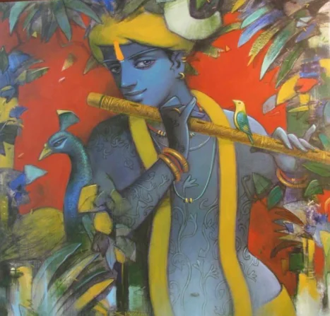
Poster color drawing is artwork created using opaque, water-based poster paints. The colours can be applied directly for a rich, solid finish or mixed with a little water when a softer effect is required.
One of the biggest advantages of poster colour painting is its flexibility. You can create bold areas of colour, paint over certain mistakes after the surface dries and experiment with different styles without needing complicated equipment.
Because poster colours work especially well with simple shapes and strong contrasts, beginners can often achieve attractive results without advanced painting experience.
Materials Needed for Poster Color Drawing
You do not need an extensive collection of art supplies to begin.
A basic poster colour painting setup can include poster colours, drawing paper of around 200 GSM or thicker, round and flat brushes, a palette, a pencil, an eraser, clean water and masking tape.
Thicker paper is generally preferable because repeated applications of water and paint can cause thin sheets to bend or wrinkle.
When starting out, focus on a small collection of useful colours instead of purchasing every available shade. Red, blue, yellow, green, white, black and a few earth tones can already produce a wide range of combinations.
Easy Poster Color Drawing Ideas for Beginners
Choosing the right subject can make your first few paintings much easier. Subjects with clearly defined shapes and larger areas of colour are usually the most beginner-friendly.
1. Sunset Landscape
A sunset is one of the easiest poster color drawing ideas for beginners because it allows you to experiment with warm colour transitions.
Start with shades such as yellow, orange, red and soft purple. Once the background is dry, add darker silhouettes of trees, birds, hills or buildings.
The contrast between a bright sky and darker foreground can create a dramatic painting without requiring complicated details.
2. Mountain Scenery
Mountain landscapes work particularly well with poster colours because they can be built using simple layered shapes.
Create a light sky first, followed by distant mountains in softer shades. Add darker mountains or trees toward the foreground to create depth.
You do not need to paint every rock or leaf. Clear shapes and colour variation can communicate the scene effectively.
3. Floral Poster Color Drawing
Flowers are another excellent choice for beginners.
Start with one large flower or a small group of blooms rather than an entire garden. Sunflowers, lotuses, daisies and simple tropical flowers work especially well because their petals can be divided into clear sections.
Use darker tones near the centre and lighter colours toward the edges to give the petals more dimension.
4. Peacock Painting
Peacocks are popular subjects for colourful artwork because their feathers naturally allow you to experiment with blue, green, turquoise and touches of warmer colour.
Beginners can simplify the form instead of attempting a completely realistic bird. Focus on the silhouette, curved neck and decorative feather shapes.
This approach works especially well for traditional or folk-inspired poster colour paintings.
5. Village Scenery
A simple village scene can include a small house, pathway, tree, fields and sky.
Keep the composition uncluttered and use larger blocks of colour. Instead of adding dozens of details, let the shapes of the houses, trees and landscape create the visual interest.
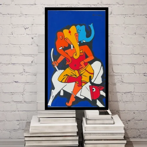
Village scenes can also be adapted into Indian folk-inspired artwork using brighter colours and decorative patterns.
6. Night Sky Painting
A night sky is a simple way to experiment with darker colours.
Create a deep blue or purple background and add stars, a moon, clouds or the silhouette of trees and buildings. Small touches of white can immediately make the artwork feel brighter.
This is a useful beginner project for learning contrast.
7. Geometric Abstract Art
You do not always need to paint a recognisable subject.
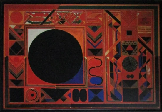
Divide the paper into geometric shapes and experiment with combinations of bold and neutral colours. Circles, rectangles, curved lines and irregular blocks can create interesting abstract compositions.
This is also a useful exercise for understanding balance and colour relationships.
8. Tree Silhouette
A tree silhouette is one of the simplest poster color drawing ideas.
Paint a colourful sky using two or three blended shades. Once it dries, create the tree using black, dark brown or another deep colour.
The strong contrast makes the artwork look detailed even though the technique itself is relatively simple.
9. Mandala-Inspired Design
Poster colours are well suited to decorative patterns because of their opaque finish.
Begin with a simple circular structure and divide it into repeated shapes. Fill each section with a controlled colour palette rather than using too many different shades.
If you are new to mandalas, keep the first design simple and gradually add finer details as you become more confident.
10. Beach or Ocean Scenery
Beach paintings allow you to work with blues, turquoise, beige and white.
Divide the composition into sky, ocean and sand, then add details such as waves, palm trees, boats or a sunset.
Using white paint for small wave highlights can give the ocean more movement without complicated brushwork.
Easy Poster Color Drawing Step by Step
If you are creating your first poster colour painting, a simple process can make the experience easier.
Step 1: Choose a Simple Subject
Start with an idea that contains only a few main elements, such as a sunset, flower or landscape.
Avoid highly detailed portraits or complicated scenes for your first attempt.
Step 2: Make a Light Pencil Sketch
Draw only the main outlines.
Keep the pencil lines light so that they do not remain visible through lighter areas of paint.
Step 3: Prepare Your Colours
Decide on the main palette before painting.
Mix small amounts of the shades you expect to use and test them on a separate piece of paper when necessary.
Step 4: Paint the Background
Begin with larger background areas such as the sky, wall, water or landscape.
Working from larger shapes toward smaller details usually keeps the composition cleaner.
Step 5: Add the Main Subject
Once the background is dry, begin painting the main object.
Use solid areas of colour first before adding shadows, highlights or decorative details.
Step 6: Build the Details
After the larger forms are complete, add smaller elements such as leaves, patterns, highlights and outlines.
Avoid repeatedly painting over the same area while it is wet, as this can make the colours muddy.
Step 7: Let the Painting Dry
Allow the artwork to dry fully before erasing remaining pencil marks, adding final details or preparing it for display.
Poster Color Drawing Techniques Worth Learning
You do not need dozens of techniques to create attractive poster colour paintings. A few basic methods can make a noticeable difference.
Colour Blocking
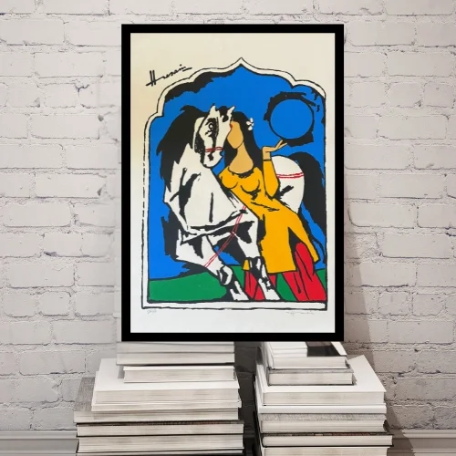
Colour blocking means filling clearly defined areas with solid shades.
It is one of the strongest techniques for poster colours because their opaque finish creates clean, bold surfaces.
This works particularly well for flowers, geometric art, folk designs and stylised landscapes.
Layering
Poster colours can be applied in layers.
Allow the first layer to dry before painting another colour over it. This helps keep the shades clean and prevents unwanted mixing.
Layering can also be used to correct small mistakes.
Blending
For softer transitions, place two colours next to each other while they are still slightly wet and gently blend the meeting point.
Avoid repeatedly brushing the same section, as too much mixing can make the colour dull.
Dry Brush Technique
Use a brush with very little water and paint, then lightly drag it across the paper.
This creates textured marks that can be useful for grass, tree bark, fabric, clouds and other surfaces.
Stippling
Stippling involves creating texture with small dots or dabs of colour.
It can work well for flowers, trees, decorative patterns and areas where you want to suggest detail without drawing every element individually.
How to Choose Colours for Poster Color Painting
Colour selection can change the entire mood of your artwork.
For a warm composition, experiment with red, orange, yellow and brown. For a calmer look, use combinations of blue, green, lavender and softer neutral shades.
You can also use complementary colours to create contrast. Blue and orange, red and green, or yellow and purple can create striking combinations when used carefully.
A useful beginner approach is to select one dominant colour, one secondary colour and one accent colour. Limiting the palette often creates a more balanced result than trying to include every colour at once.
Poster Color vs Watercolor vs Acrylic
Although these painting mediums can sometimes look similar, they behave differently.
| Feature | Poster Color | Watercolor | Acrylic |
| Finish | Matte and opaque | Transparent and soft | Usually opaque |
| Water-based | Yes | Yes | Yes |
| Beginner-friendly | Yes | Yes, but requires control | Yes |
| Easy to paint over | Relatively easy after drying | More difficult | Usually easy |
| Suitable for paper | Yes | Yes | Yes |
| Best suited for | Illustrations, bold paintings and studies | Transparent washes and delicate paintings | Canvas, paper and layered paintings |
Poster colour sits somewhere between the softness of watercolour and the stronger coverage associated with acrylic.
For beginners who enjoy bold artwork on paper, it can be an accessible place to start.
Common Poster Color Painting Mistakes
One common mistake is applying too much water. Poster colours need some water for smooth application, but excessive dilution can reduce their characteristic opacity.
Another mistake is painting a fresh layer before the previous one has dried. This can cause colours to mix unexpectedly or lift the paint underneath.
Using very thin paper can also create problems because repeated wet layers may cause the surface to warp.
Beginners sometimes keep correcting the same section again and again. Instead, allow the area to dry before deciding whether another layer is actually necessary.
Finally, avoid choosing too many unrelated colours. A smaller, planned palette usually creates a stronger finished painting.
How to Make Poster Color Drawing Look Better
Clean edges can immediately make a poster colour painting appear more polished. Use the right brush size for each section and avoid using a very small brush for large areas.
Create contrast between the main subject and the background so that important elements remain visible.
You can also add depth by making distant objects slightly lighter and foreground elements darker or more detailed.
Most importantly, do not try to add detail everywhere. Leaving some areas simple gives the viewer’s eye a place to rest and helps the main subject stand out.
Framing and Displaying Poster Color Artwork
A finished poster color drawing can become a colourful addition to a home when presented thoughtfully.
Before framing, ensure the painting is completely dry. A simple white, natural wood or black frame can work well depending on the colours and style of the artwork.
Because poster colour artwork is usually created on paper, protecting it behind suitable glazing can help reduce exposure to dust, moisture and accidental contact.
Avoid placing the artwork in areas with excessive humidity or prolonged direct sunlight.
If you enjoy colour-rich artwork but prefer collecting finished pieces, you can also explore The Brushstrokes Co. artwork collection for original paintings and art created for contemporary interiors.
Caring for Poster Color Paintings
Poster colour artwork should be kept dry and protected from unnecessary handling.
Avoid touching the painted surface repeatedly, particularly if the work is unframed. If you store the painting rather than display it, keep it flat and place protective paper between artworks.
For framed pieces, clean the outside of the frame carefully rather than applying cleaning products directly to the artwork.
Simple care can help preserve the colours and condition of the painting for longer.
Poster Color Painting as a Creative Gift
A handmade poster colour painting can also become a meaningful gift.
Floral paintings can work well for birthdays or housewarmings, while traditional motifs may suit festive occasions. Abstract artwork can be created around colours that have personal meaning for the recipient.
The value of handmade art often comes from the thought and time behind it rather than complexity.
For those looking for professionally created art gifts, The Brushstrokes Co. also offers artwork suitable for festive gifting, wedding gifting and corporate gifting.
FAQ About Poster Color Drawing
What is poster color drawing?
Poster color drawing is artwork created using opaque, water-based poster paints. The medium is known for producing bold, matte areas of colour and works particularly well on thicker drawing paper.
Is poster color good for beginners?
Yes. Poster colours are relatively easy to use, provide strong coverage and allow some mistakes to be painted over after drying, making them suitable for beginners.
What are some easy poster color drawing ideas?
Beginners can start with sunsets, flowers, mountain scenery, peacocks, night skies, tree silhouettes, geometric designs, village scenes and beach landscapes.
Which paper is best for poster color painting?
A thicker drawing or painting paper is preferable. Paper around 200 GSM or above generally handles multiple painted layers better than very thin paper.
Can poster colors be mixed with water?
Yes. A small amount of water can help improve the flow of poster colour. Too much water, however, can make it more transparent and reduce its characteristic opaque finish.
How do you blend poster colors smoothly?
Place two colours next to one another while they are still slightly wet and gently work across the meeting point with a clean or lightly loaded brush. Avoid overworking the area.
Can poster color be used on canvas?
Poster colours are primarily suited to paper and illustration work. For artwork intended specifically for canvas and long-term display, acrylic or other mediums designed for canvas may be more suitable.
Is poster color the same as watercolor?
No. Both are water-based, but poster colours are generally more opaque, while traditional watercolours are designed to create transparent layers.
How do you prevent poster color drawings from looking muddy?
Allow individual layers to dry before adding new colours, clean your brush when changing shades and avoid repeatedly mixing several colours in the same wet area.
Can poster color paintings be framed?
Yes. Once completely dry, poster colour paintings on paper can be framed. Protecting the artwork behind suitable glazing can help keep it cleaner and reduce direct handling.